About
Project Type
Timeline
Platform
UI and UX
April 2019
Web
Employee Connect is an internal application used by employees, managers and administration to browse employee data, internal jobs and upload their work related information. Employee Connect is customised for managers and admins; helping them run their teams without any hassle.
My Role and Responsibilties
- Redesign Internal Job Application flow, Menu and icons to make it user friendly and visually appealing.
- Conduct interviews with the employees, managers and PMO admins for understanding the painpoints.
- Redesign the information architecture of the above mentioned screens.
- Make wireframes and iterate on different ideas.
- Create visual mockups for the screens.
Research
To understand the needs of the users, I interviewed with the employees, project managers and the PMO admins who use the application on a regular basis.


Physical interviews with employees, managers and PMO
Self Study by interacting
with the application
Secondary research on online applications
Pain points of Employees
Pain points of the Managers and PMO (admins)
- Tedious in filing a job application
- Under Internal Job Applications, the data are displayed in tables with over 14 columns, making the user to scroll excessively.
- Due to excessive scrolling, it is a time taking and exhausting process to apply for a job.
- So much of data is displayed which is overwhelming.
- The items in the menu are not grouped, making the user confused and spend more time searching for the options.
- Too many clicks to perform a particular task.
- Under Internal Job Applications, the data are displayed in tables with over 14 columns, making the user to scroll excessively.
- Unwanted data is displayed and the information is overflowing out of the columns.
- In the secondary level menu (accordion style), each tab has 10 submenus. The increased submenu extends beyond the screen size and hence have to scroll excessively.
Problems


Overload of Information
Most of the information that appeared on the application, was from a third party source. Hence, the text inflow was not controlled and over-bled the rows and columns
Excessive Scrolling
The information was organised on after the other horizontally and vertically, which made the user strained to view information at one go. Information was not arranged according to hierarchy.
Difficult to use
The interface was difficult to use due to many clicks, scrolls and the CTAs were missing importance. The users reported it was time taking to go to certain page or even perform a simple task.
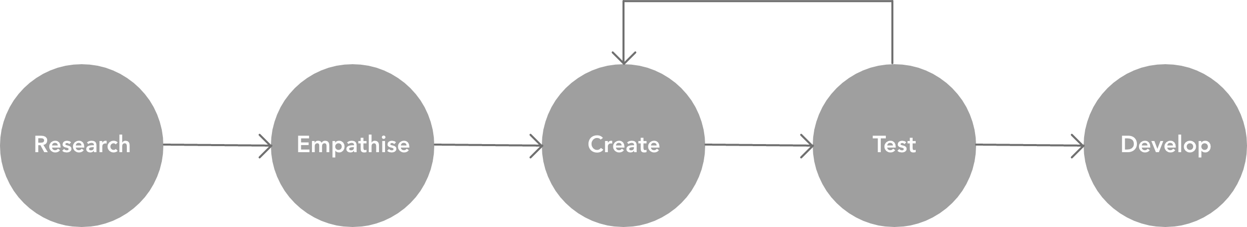
Design Process
The design process I followed was to Research >> Empathise >> Create >> Test >> Develop. I started with user research, followed by analysing the data and further making wireframes and mockups to test and finally work with the developer to develop it.

Problems I observed in the interface
Low Fidelity Wireframes
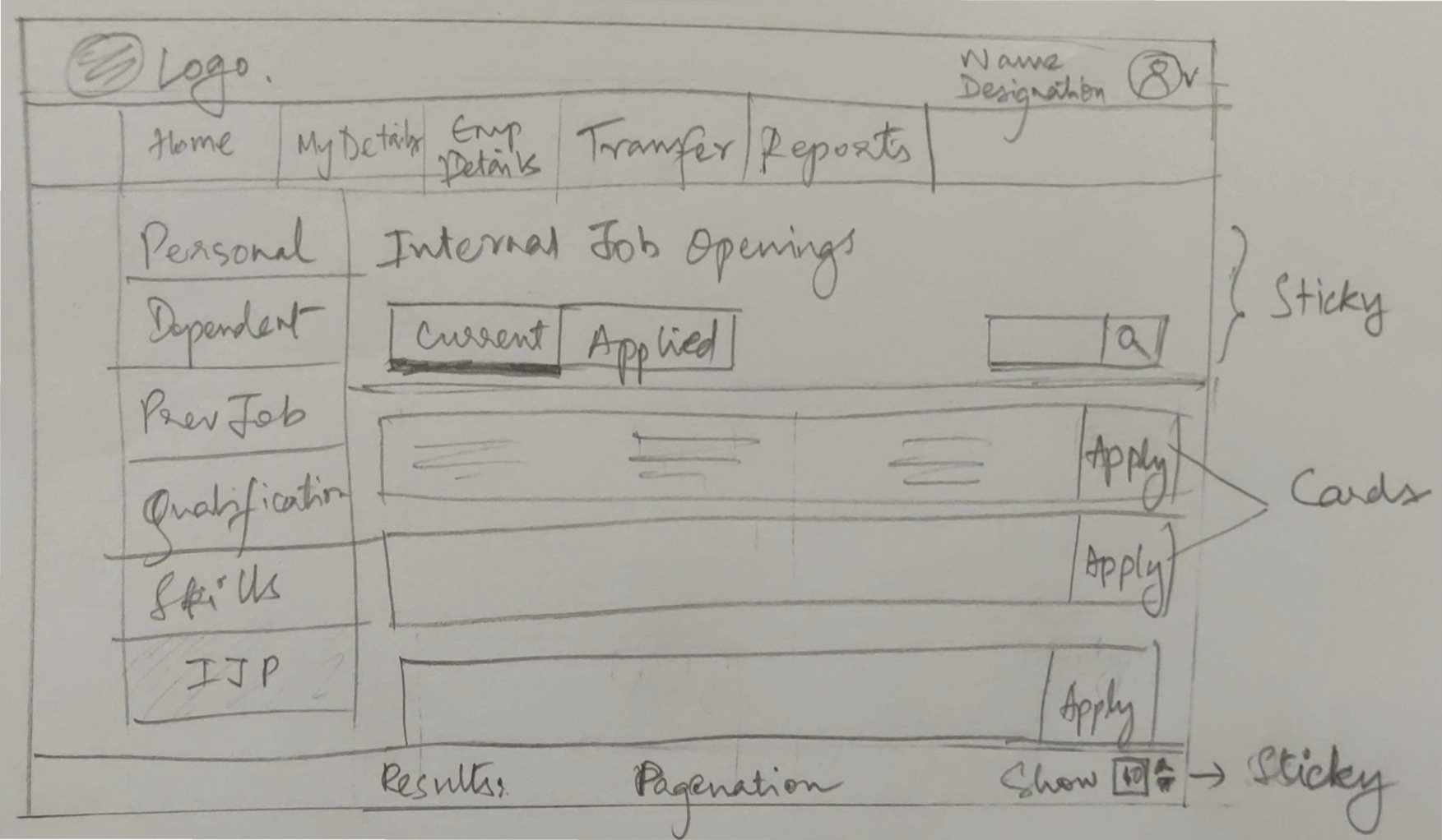
Internal Job Application screen for all employees
For the home screen is common for all the employees. The current and applied jobs have been segregated into two tabs to avoid scrolling of page when information increases. The primary CTA button is highlighted in both approaches. The page title, tabs and bottom navigation are made sticky for making the user know where he is and for quick navigation.
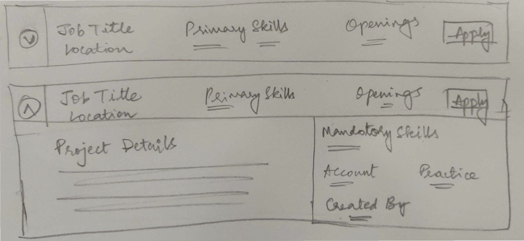
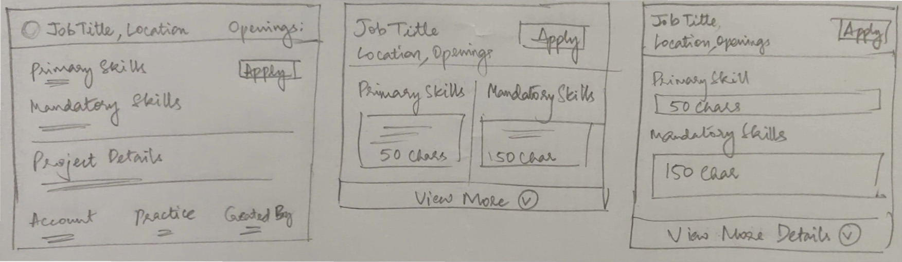
Approach 1 : Row cards for Internal Job Application Cards for all employees
The row cards are made expandable vertically in this approach. All the information are placed according to importance of hierarchy.
Approach 2 : Individual Cards ( Iterations 1, 2 and 3)
The individual cards are made small in this approach to view information at one go. All the information are placed according to importance of hierarchy.
Individual Cards for Manager
Individual Cards for PMO Admin
High Fidelity Wireframes
Approach 1 : Row cards for Internal Job Application
Approach 2 : Individual Cards ( Iterations 1, 2 and 3)

Final Designs
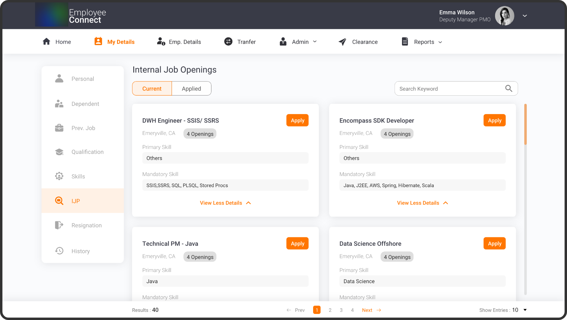
Internal Job Application Screen
Internal Job Application - Employee
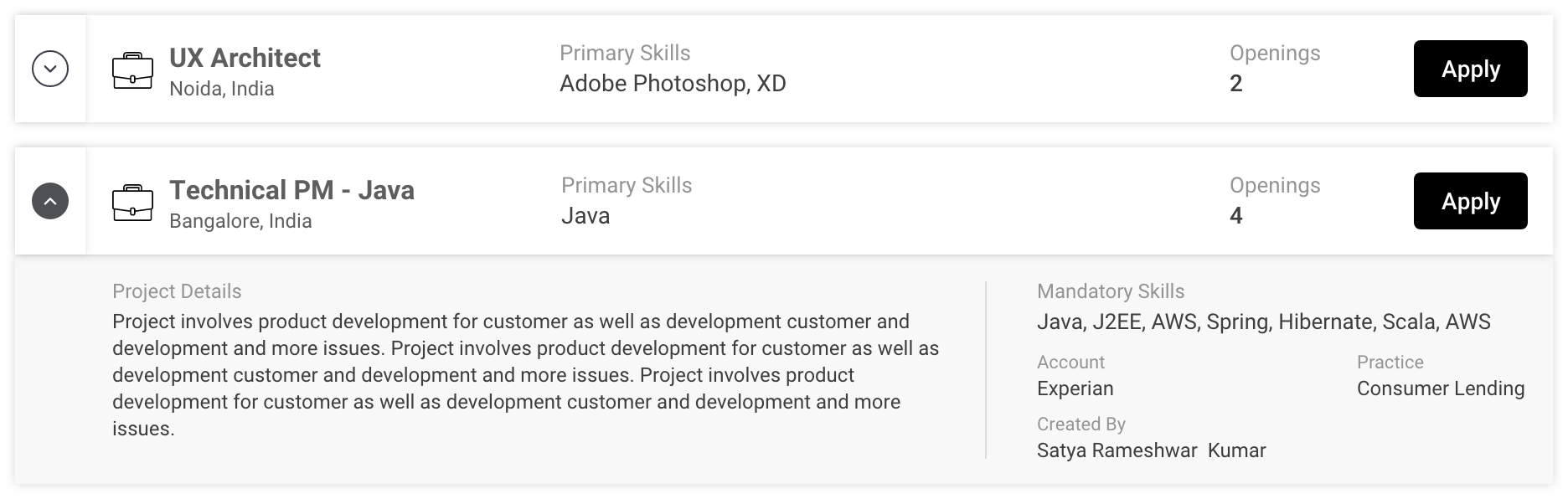
The main idea behind the card design is to convert the overload of tabular information into a short sleek card. This enables the user to scan the information at one go. In the existing application, the apply button (primary button) was located at the end of the table, making the user to scroll till the end to perform the main action. The use of icons and colours makes it fun for the user to interact.The information in the card is placed according to the hierarchy in formation. Another useful feature is the the “View More Details”, which shows the user the secondary information.
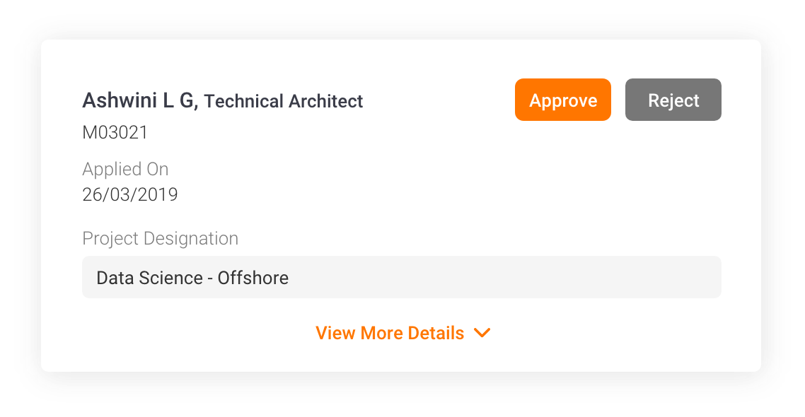
Internal Job Application - Manager
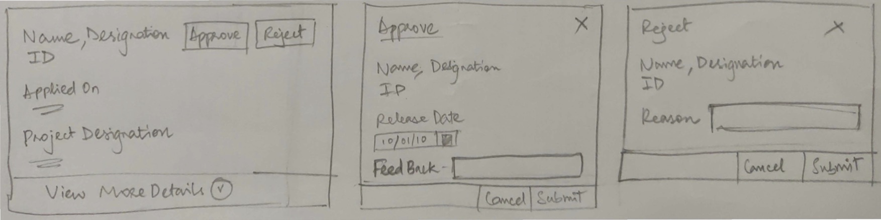
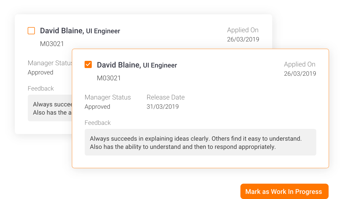
As soon as the employee applies for the job, the data is sent to the employee’s manager who will decide to either approve/reject.In the existing application, it was difficult for the manager to remember the details of the person while scrolling till the end to perform the action on the application. The card based approach makes the user to easily perform his actions. An option to expand and collapse is made for the user to view the information as he pleases.
Job Application Card
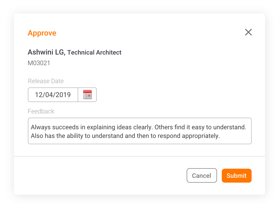
Approving Application
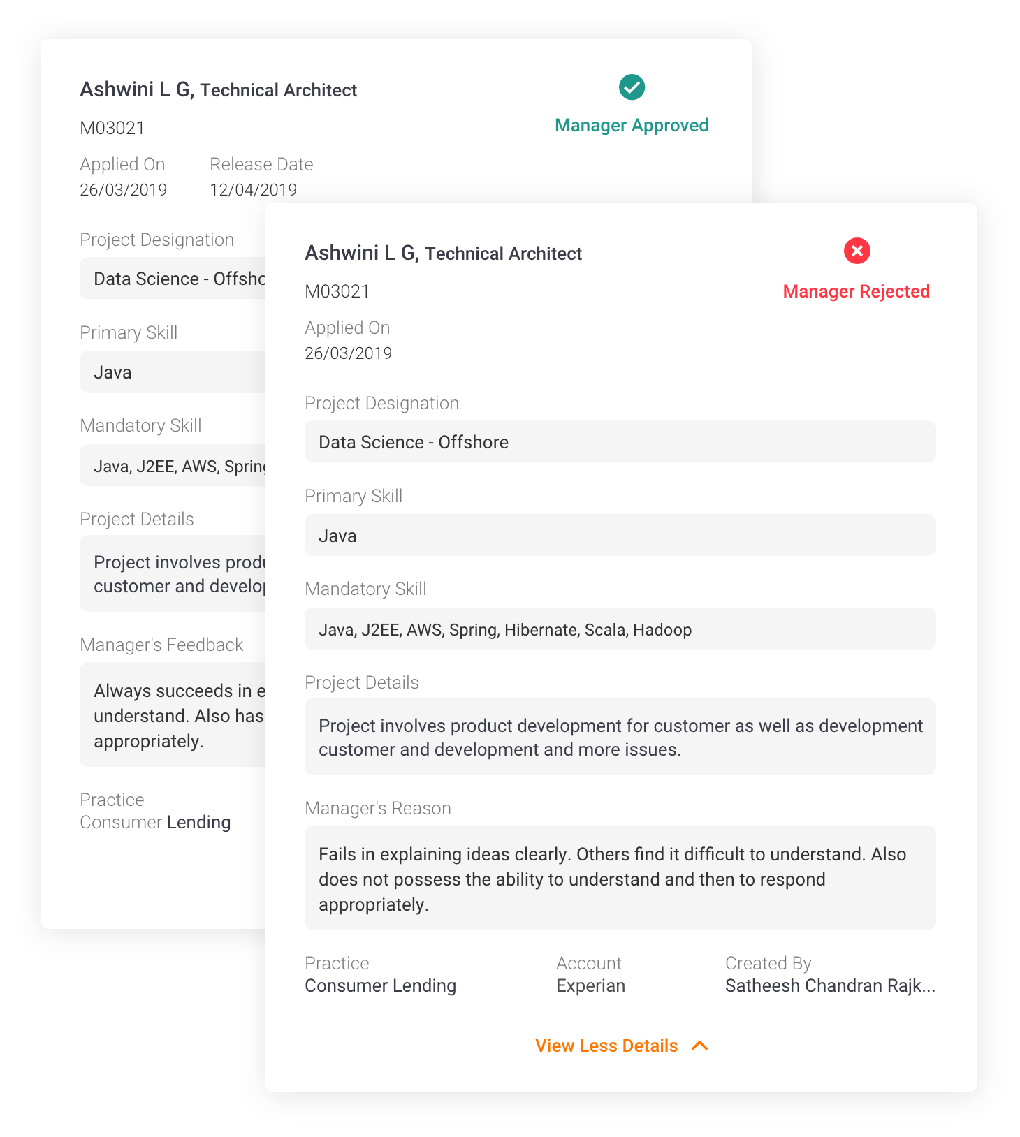
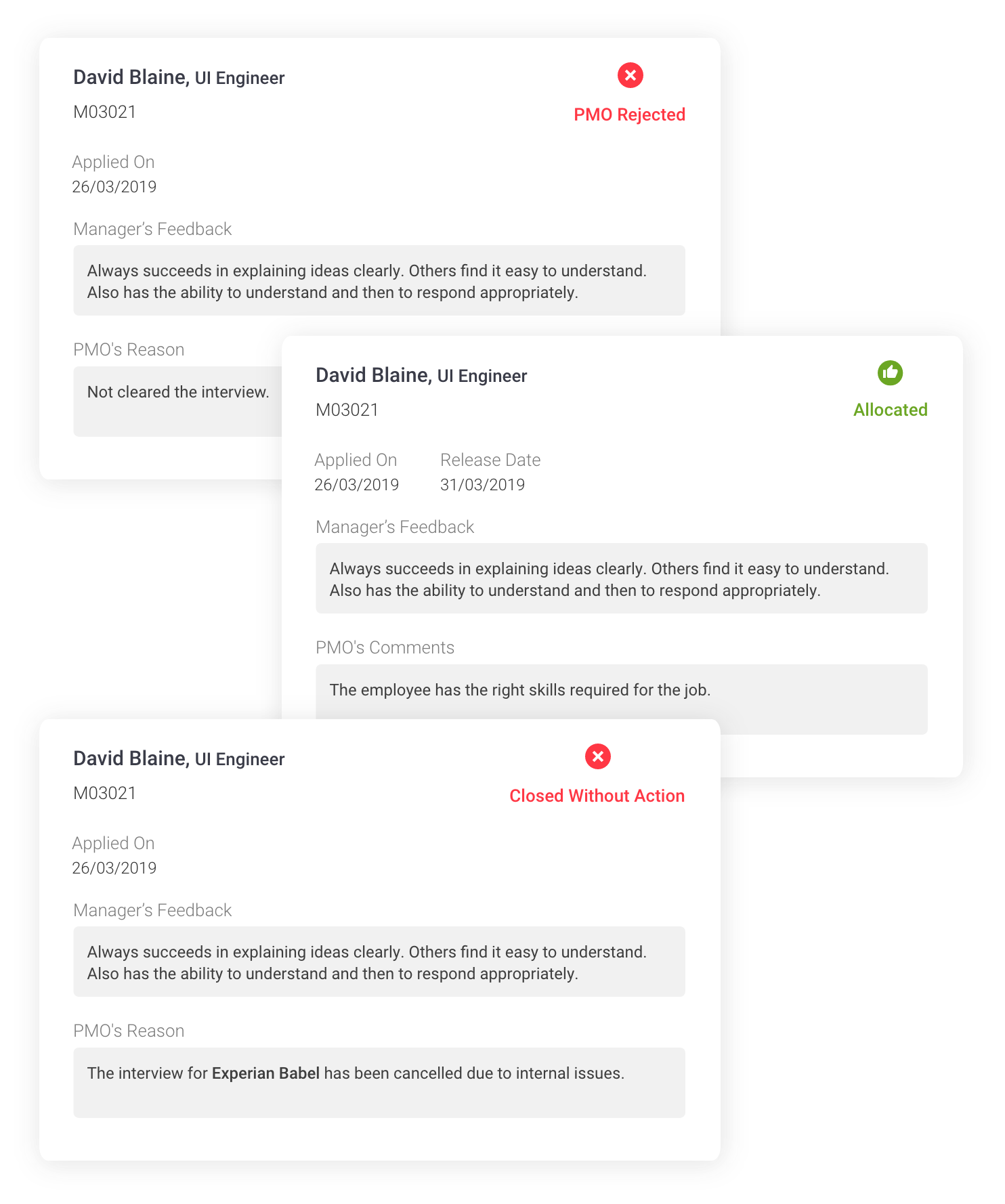
As soon as the Manager approves or rejects, the status of the card changes to action performed. Also the manager can view his feedback or reasons given by him in the card. The employee will receive information on the status of the application by checking the status of the card. The manager’s feedback and reasons will not be visible to the employee.
As soon as the employee applies for the job, the data is sent to the employee’s manager who will decide to either approve/reject.In the existing application, it was difficult for the manager to remember the details of the person while scrolling till the end to perform the action on the application. The card based approach makes the user to easily perform his actions. An option to expand and collapse is made for the user to view the information as he pleases.
Post Approval/ Rejection
Internal Job Application - Project Management Office (PMO)
Allocation by PMO
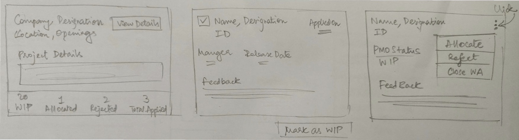
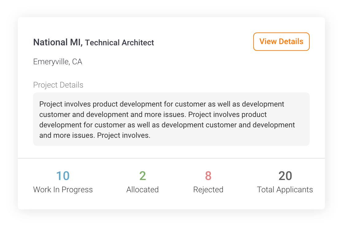
PMO’s main function is to allocate and deallocate employees from bench to project and vice versa. They use employee connect for this sole reason. In the existing application, once the PMO come to the Internal Job Application screen, all applications which are approved by the manager is listed in a data table. It is not segregated by any means, and it is confusing for the user to select multiple people for same interview. Keeping this in mind, I have created a card based approach which starts by segregating applications according to the projects selected. Here it shows the basic information like the project info and number of people applied, rejected, under interview process and allocated.
The PMO enters a project by clicking on “ View Details”, it shows the cards of all the manager approved cards. The PMO then has to multi-select/individually select people to put them through an interview. Here multi-selecting and marking the employees for WIP is done.
Work In Progress
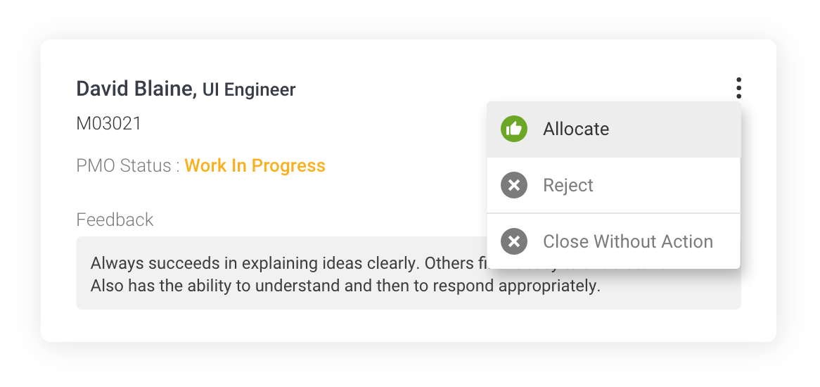
Allocation/ Rejection/ CWA
Once the interview round is completed, the PMO has to perform the action on the card to allocate/reject/CWA. PMO decision is final. CWA (Close Without Action) is rejecting the application even before the interview round. This happens if there is any mismatch in details or the positions are filled for the job.
It is very necessary for the PMO to either give comments or reason if the person is allocated or rejected respectively. It is optional to give a feedback if the person’s application is closed without action (CWA).
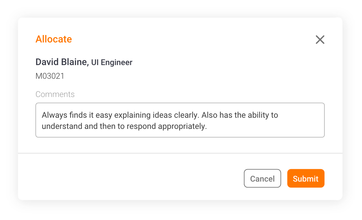
PMO Comments
Status Update
Once the PMO has given the action, it reflected on the cards with the feedback supporting his actions. The comments made by the PMO will be visible to the manager except for the employee.
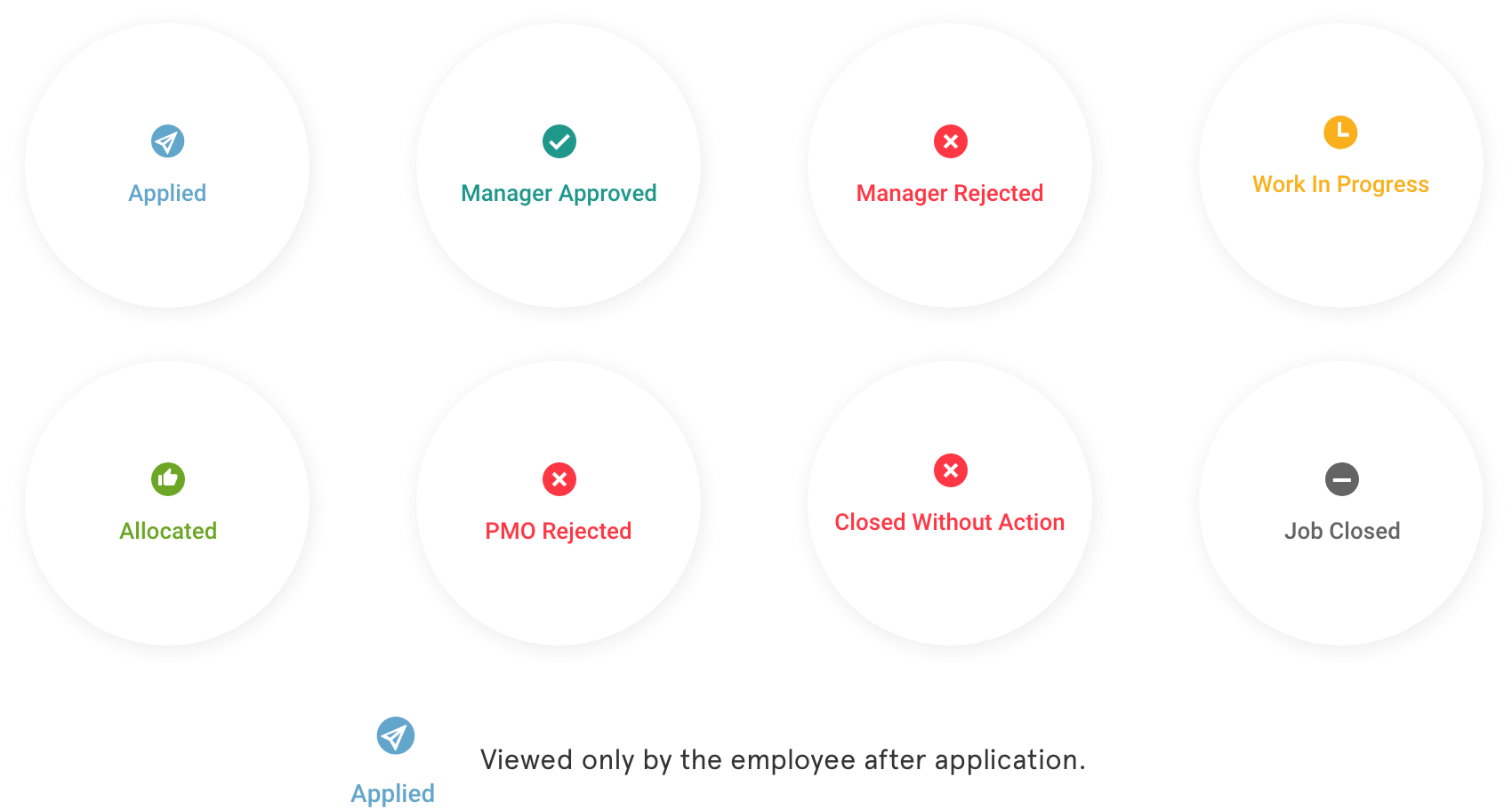
Job Status Indicator
These are the indicators which will appear on the cards of the job application which the employee has applied. Most of the statuses can be viewed by employees, managers and the PMO except for the 'applied', which can be viewed only by the employee.
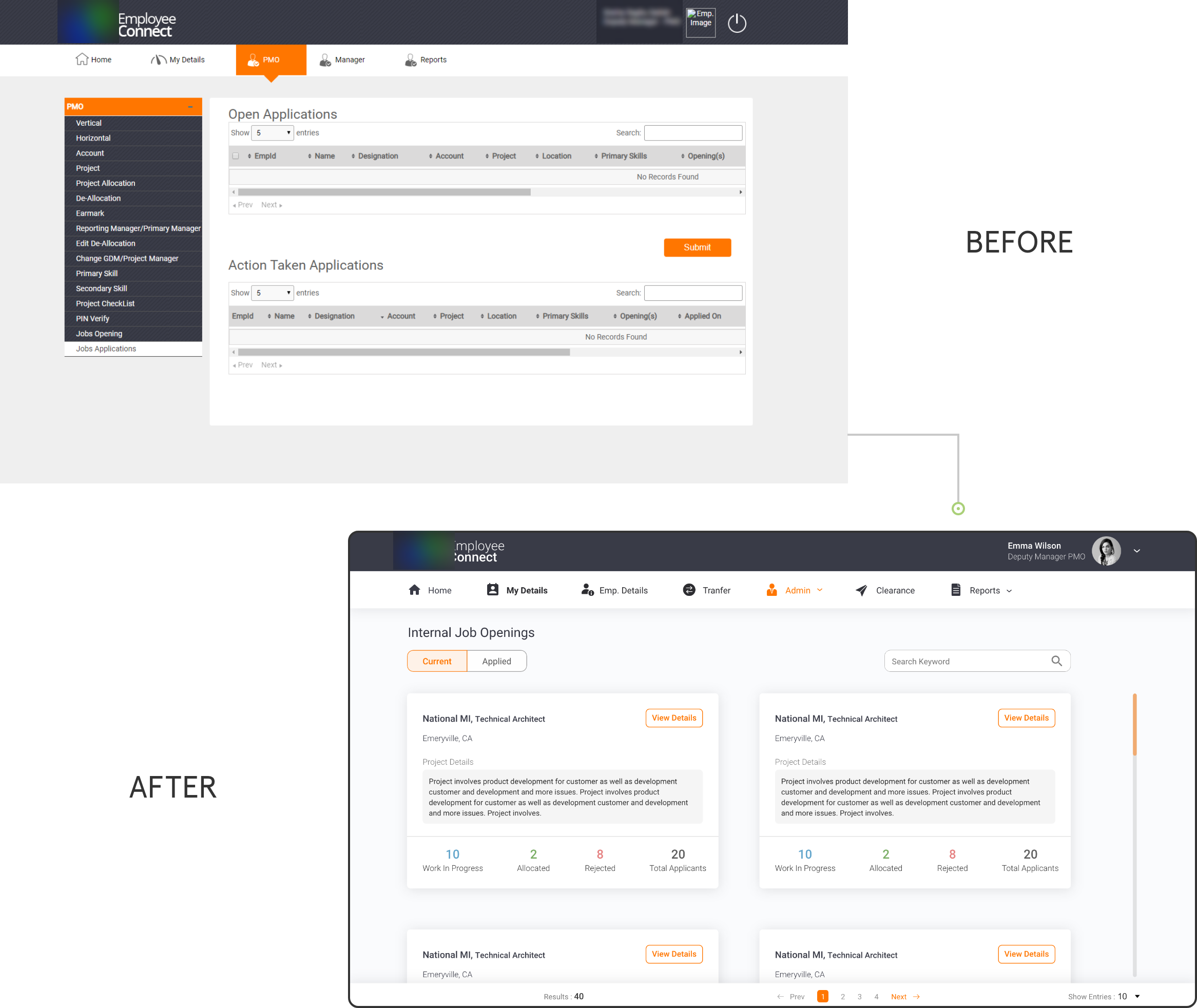
Before and After
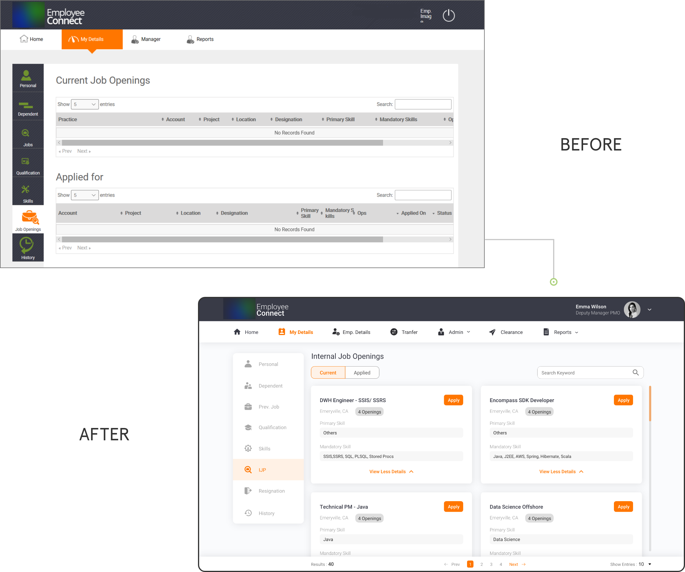
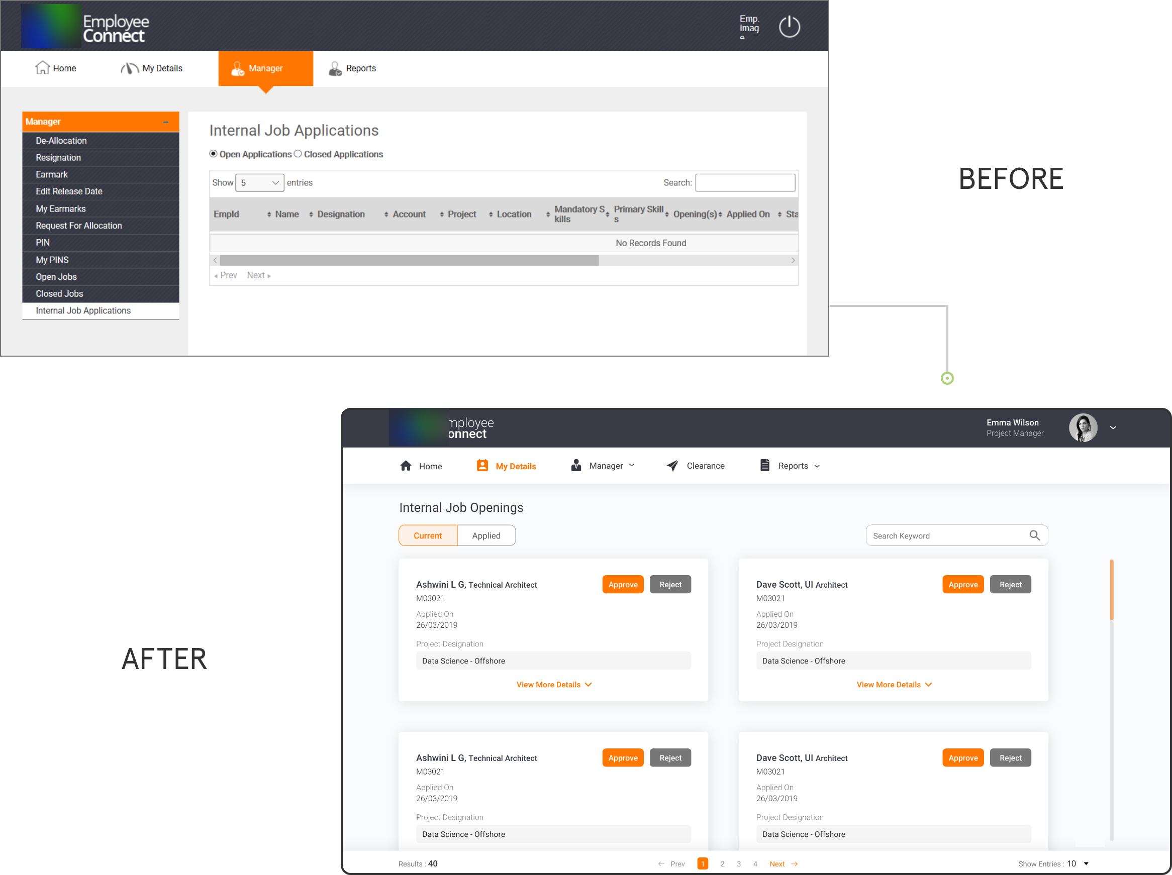
These are the before and after images of the redesigned screens of Internal Job Applications for Employee, Manager and PMO.
Due to NDA policies, I have shown only these screens.
Employee Internal Job Application Screen
Manager Internal Job Application Screen
PMO Internal Job Application Screen